
Introduction
Overview
This guide serves as a training resource for the UME Program Reach - Census Dashboard. The UME Program Reach - Census Dashboard can be utilized to assist in interpretation of census data for use in analyzing program impact.
Data Controls & Export
Most of the data in this dashboard can be controlled (or as we like to say, cut) via dashboard parameters at the top of the dashboard. Most data in tabular views can also be exported for use in your own analytical tools.
Charts
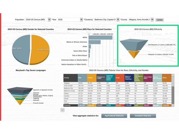
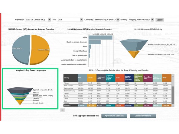
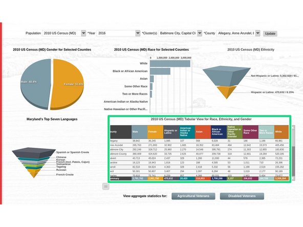
The dashboard provides five charts, with three additional charts accessible via drill-downs.
- Gender for Selected Counties: provides a visualization of the gender split for selected counties.
- Race for Selected Counties: provides a visualization of the racial distribution for selected counties.
- Ethnicity: provides a visualization of the ethnicity split for selected counties.
- Maryland’s Top Seven Languages: provides a distribution of the top seven languages in Maryland as identified by AGNR.
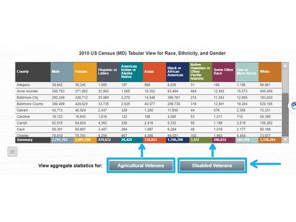
- Tabular View for Race, Ethnicity, and Gender: provides detail level tabular data for the aforementioned categories. This data can be exported for your own analysis.
Tips to get the most out of this guide
- Click images to open the enlarged version in a new tab.
- Keep an eye out for tips and notes within each step. These contain useful information about functionality (like drill-downs) in the dashboard.
- Logging in via the button in the top right of the guide (use SSO) will allow you to add comments to each step that are visible to other readers if you find a piece of information that needs clarification or want to highlight a particular step.
Additional Notes
- As of 6/15/2020, the Year parameter has been removed from the dashboard as it is not needed since each population is a static data set from a specific year.
-
-
The UME Program Reach - Census dashboard provides a high level snapshot, with drill-down capability, of census data for analysis when determining program reach and impact in MD's counties.
-
The dashboard provides breakdowns of gender, race, ethnicity, and languages for each of MD's counties where the data is provided.
-
The dashboard has five full census data sets for different census populations (2010 US Census (MD), 2010 US Census (MD) 5-19 Youth, Agricultural Census, Individuals With Disabilities (IWD), Veterans) and two aggregate data sets (Agricultural Veterans, Disabled Veterans).
-
-
-
Only one population may be viewed in the charts at a time.
-
The parameters at the top of the dashboard will allow you to cut the data by the census dataset and cluster / county.
-
Select the desired data population, choose your clusters, optionally choose specific counties in those clusters, and then click update. The data in all charts will be filtered to that data set and those specific counties.
-
Tip: You can select several clusters, and then deselect specific counties in each cluster. For example, if I only wanted to look at Baltimore City and Baltimore County, I would select the Baltimore City Cluster and the Northern Maryland Cluster, and then use the county dropdown to deselect other counties in the Northern Maryland Cluster.
-
Tip: You need to drill back up to the root chart (chart that displays when dashboard opens) prior to selecting new parameters from the dropdowns at the top of the dashboard.
-
All tabular charts will provide a menu button in the lower left corner of the chart that, when clicked, will allow you to export that chart's data. The data exported will be what is currently shown in the dashboard and will abide by any filters selected in the dashboard parameters at the top of the dashboard.
-
-
-
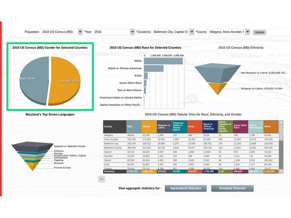
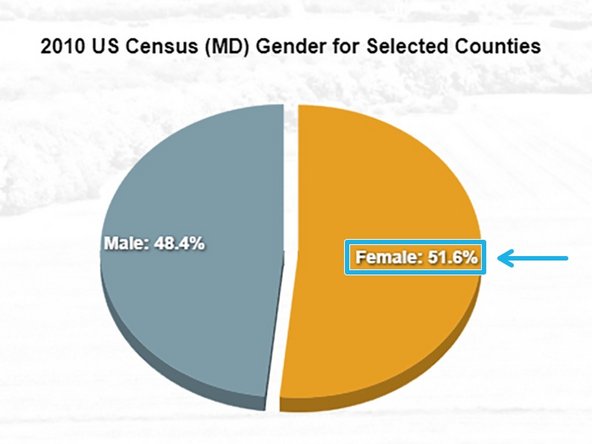
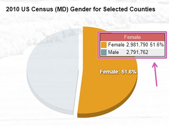
There is no drill-down capability in this chart.
-
The Gender for Selected Counties chart provides a visualization of the gender split for the counties selected in the dashboard parameter at the top of the dashboard.
-
The pie chart shows percentages of each gender for selected counties.
-
When hovering over a specific slice, the total value of the slice will be displayed in a tooltip, along with the other slices in descending order below the slice you are hovering over.
-
-
-
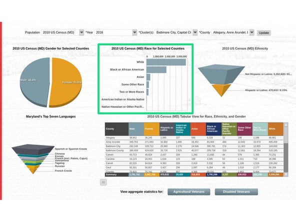
There is no drill-down capability in this chart.
-
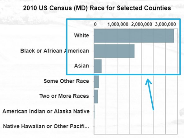
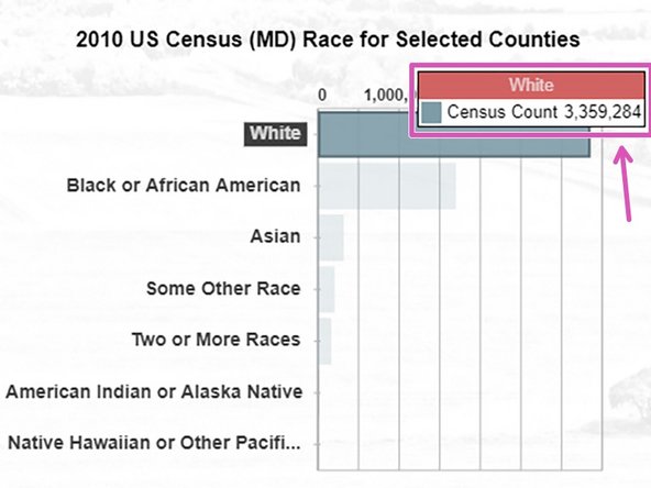
The Race for Selected Counties chart provides a visualization of the racial distribution for the counties selected in the dashboard parameter at the top of the dashboard.
-
The bar chart shows the racial distribution of the selected counties in the county parameter at the top of the dashboard.
-
When hovering over a specific bar, the total value of the bar will be displayed in a tooltip.
-
-
-
There is no drill-down capability in this chart.
-
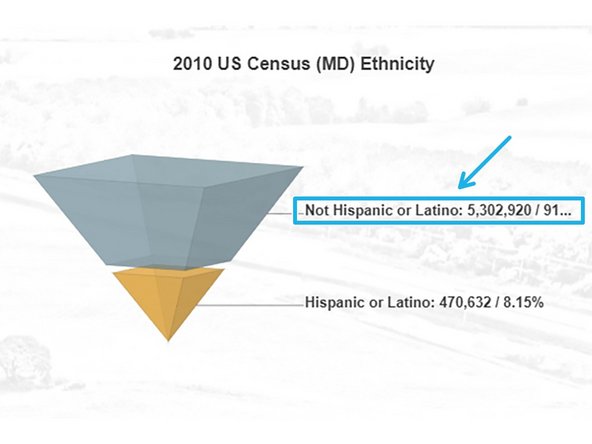
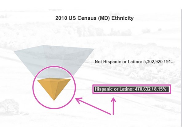
The Ethnicity chart provides a visualization of the ethnicity split for the counties selected in the dashboard parameter at the top of the dashboard.
-
The funnel chart shows percentages and total values for each ethnicity for selected counties.
-
When hovering over a specific slice, the slice will focus and the corresponding text will highlight to provide more clarity.
-
-
-
This chart drills into detailed LEP data. The detailed data will replace the tabular chart to the right with a new tabular chart solely for LEP data.
-
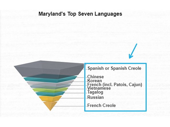
The Maryland's Top Seven Languages chart provides a visualization of the language distribution for the counties selected in the dashboard parameter at the top of the dashboard.
-
The funnel chart shows the distribution of the top seven languages in MD (as identified by AGNR) for selected counties.
-
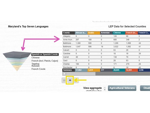
Clicking on any slice will drill to detailed LEP data. The data will appear in the tabular chart to the right.
-
Drill back to the other chart using the back arrow in the lower left corner of the new LEP chart.
-
-
-
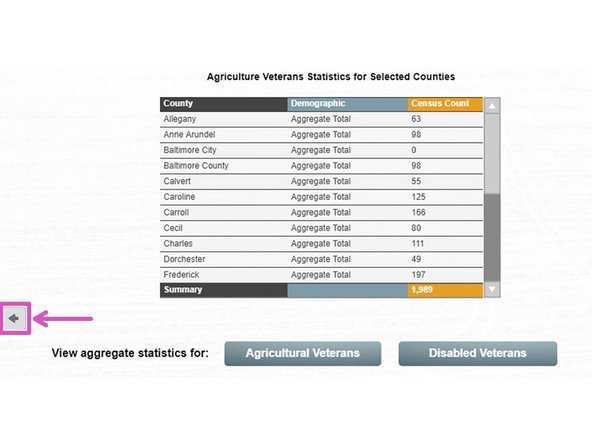
The two buttons below this chart drill aggregate data into the space where the primary chart resides.
-
The Tabular View for Race, Ethnicity, and Gender chart provides detailed data for each county broken down by Race, Ethnicity, and Gender. The data can be cut using the cluster / county parameter at the top of the dashboard.
-
There are two additional tabular charts for Agricultural Veterans and Disabled Veterans, respectively, that can be accessed via the gray buttons below the primary chart. These data sets are populations not available in the parameter dropdown at the top of the dashboard.
-
Drill back to the original tabular chart using the arrow in the bottom left corner of the new chart.
-


Congratulations, you have completed the training guide for the UME Census Dashboard. Please contact Latoya Hicks with any questions regarding the data on the dashboard. Technical issues should be sent to dashboards@umd.edu.
Congratulations, you have completed the training guide for the UME Census Dashboard. Please contact Latoya Hicks with any questions regarding the data on the dashboard. Technical issues should be sent to dashboards@umd.edu.