
-
-
This dashboard displays the current and past Procurement Orders (PO’s) that have been established in your unit. You can use the filters across the top of the page to refine your view by fiscal year and unit.
-
The data is pulled nightly from KFS. The dashboard does not include PO’s that have not been approved or are otherwise pending.
-
-
-
This chart provides an overview of the open and closed PO’s, as designated in KFS.
-
Open means that the PO has not yet been fully paid and is designated as Open in KFS.
-
Closed means that the PO has been fully paid and/or has been designated as Closed in KFS.
-
A PO’s full value will be contained in either the Open or the Closed slice. No portion of a PO will show in both.
-
An active PO that has any outstanding balance will return the full amount of the PO in the Open category. For example, a PO established for $100 that has a $70 invoice paid on it, will return a value of $100 in Open PO’s and $0 in Closed PO’s.
-
This PO will not be reflected in the Closed slice until it has all $100 paid or is designated as Closed in KFS.
-
-
-
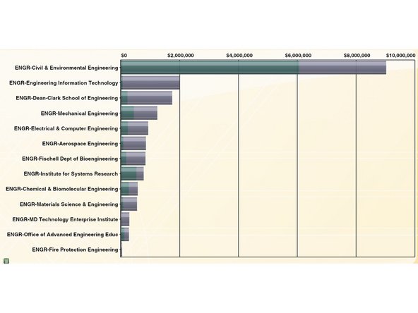
This chart provides an overview of the open and closed PO’s, by department, as designated in KFS.
-
This data is consistent with the pie chart in the top left and follows the same rules about what is considered Open and Closed.
-
This chart offers a comparison by department of the total dollar value of established PO’s, with a breakdown of Open vs. Closed.
-
-
-
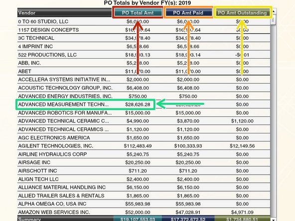
This chart provides a list of the established PO’s by vendor, how much the PO was worth, how much was paid, and how much remains outstanding.
-
The PO Total Amt column represents the total aggregate dollar value of all PO’s established with a given vendor. It will reflect the new value of a PO that is formally amended.
-
The PO Amt Paid column represents the aggregate dollar value of all invoices paid to a given vendor.
-
The PO Amt Outstanding column represents the aggregate dollar value of all outstanding balances owed to a given vendor.
-
A negative amount signals that the PO Amt Paid column is greater than the PO Total Amt column, which means more was paid to the vendor than the value of all the PO’s.
-
This can happen if a PO has, for example, a 2-way match with low tolerance.
-
Clicking on a row in this chart will update the bottom middle and bottom right charts.
-
-
-
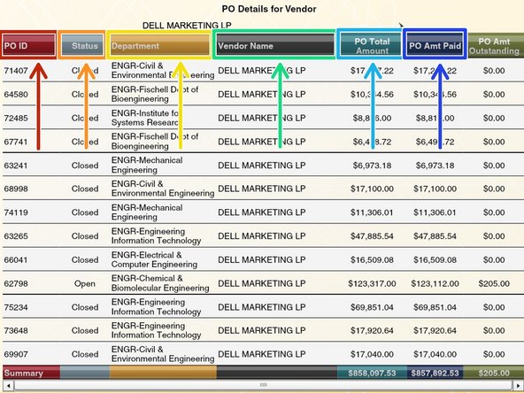
This chart provides a list of the established PO’s and associated status for a selected vendor. It is driven by the chart on the bottom left.
-
The PO ID column is the Procurement Order assigned by KFS.
-
The Status column will show the PO as either Open or Closed.
-
The Department column shows in which department the PO was established. It is affected by the filters at the top of the dashboard.
-
The Vendor name column is driven by the chart on the bottom left. You cannot view more than one vendor at a time.
-
The PO Total Amount column represents the total dollar value of the PO. It will reflect the new value of a PO that is formally amended.
-
The PO Amt Paid column represents the aggregate dollar value of all invoices paid on the PO.
-
-
-
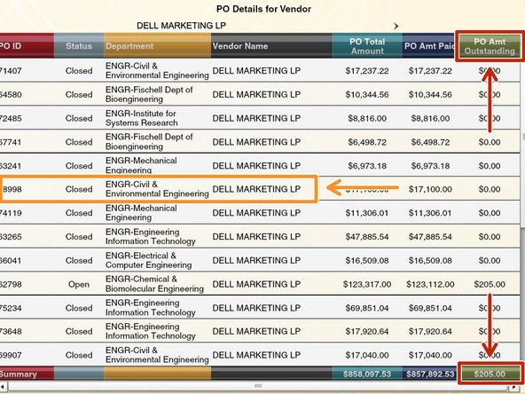
The PO Amt Outstanding represents the dollar value encumbered but not paid to a vendor on the PO.
-
A negative amount signals that the PO Amt Paid column is greater than the PO Total Amount column, which means more was paid to the vendor than the value of the PO.
-
This can happen if the PO has, for example, a 2-way match with low tolerance.
-
Clicking on a row in this chart will provide additional details about any payments made on the PO.
-
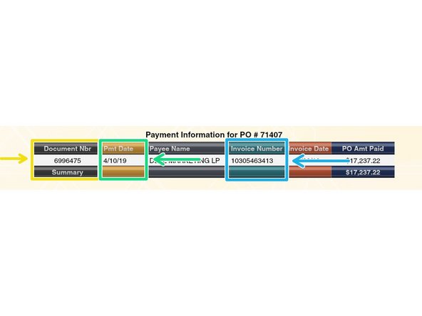
This drill-down provides information about payments made on invoices associated with the PO.
-
The Document Nbr column shows the KFS document number of each Payment Request action taken in KFS with the Status of “Final.”
-
The Pmt Date column shows the Pay Date of the invoice, taken from the View Payment History tab of the KFS Payment Request document.
-
The Invoice Number column shows the Invoice Number of the Vendor, taken from the Invoice Info tab of the KFS Payment Request document.
-
-
-
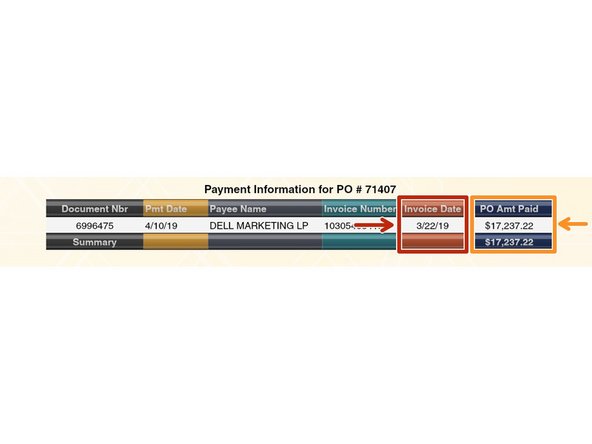
Clicking on a row in this chart will provide additional details about any payments made on the PO (continued from last step).
-
The Invoice Date column shows the date of the Vendor’s invoice, taken from the Invoice Info tab of the KFS Payment Request document.
-
The PO Amt Paid column shows the dollar amount paid to the Vendor on a given Payment Request, taken from the View Payment History tab of the KFS Payment Request document.
-
-
-
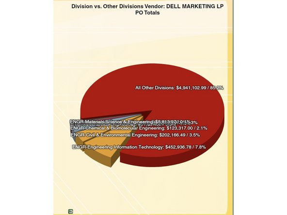
This chart provides a display of the total aggregate dollar value of all PO’s established for a given vendor, with slices representing the campus units that requested the PO’s.
-
Adding the dollar value of each pie slice will equal the PO Total Amt column for the vendor in the bottom left chart on the dashboard.
-
The vendor selected is driven by the bottom left chart on the dashboard.
-
Users with access to multiple Divisions will see a comparison of the total aggregate dollar value of all PO’s established for the vendor within their selected division(s) vs. All Other Divisions.
-
Users with access to multiple Departments will see a comparison of the total aggregate dollar value of all PO’s established in each department within their division, vs. the aggregate dollar value of all PO’s established in All Other Divisions.
-
Users with access to just one department with multiple units will see a comparison of the total aggregate dollar value of all PO’s established in their department vs. the total aggregate dollar value of all PO’s established in other depts within their college, vs. the total aggregate dollar value of all PO’s established in All Other Divisions.
-

Congratulations! You are now trained on the UMDashboards Purchase Order dashboard. If you have any comments, questions, or concerns about the dashboard or this training, please email dashboards@umd.edu.
Congratulations! You are now trained on the UMDashboards Purchase Order dashboard. If you have any comments, questions, or concerns about the dashboard or this training, please email dashboards@umd.edu.